

(I've been drinking mine with ginger ale, but I think it would be nice with soda and lime too).
For the maths geeks, I have been referring to a variety of earthquake related graphs in the past 10 days, and I think the one I have found most useful and representative is this one:
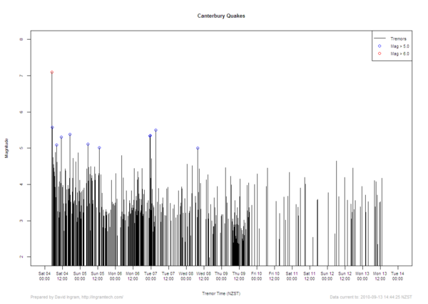
Maybe a little small to see well, but it's a plot of magnitude vs time, with blue circles representing aftershocks greater than 5.0 on the Richter scale. I reckon this is particularly reassuring, as you can see the magnitude and frequency decreasing. Anyway, that's just me.
Next post: not the earthquake - I've had enough of it, and I'm sure you have too.

No comments:
Post a Comment